5/13/16

*****A POOR MAN'S DISCLAIMER*****

If you are reading this, don't turn back now. It has most likely taken me far too long to get you here in the first place. Having said that, here is my poor man's welcome disclaimer:


***The blog you are about to view is a free site, which translates to "I got what I paid for."As a matter "O" fact, I call it my poor man's website. The work is in no particular order and for that I apologize but I am using it as a stop gap until I get my professional site up and running which is actually in the process. Trillions of zeros and ones are assembling themselves into a pleasing arrangement rivaling our very own national debt clock's prowess for number crunching .***

When it's complete, I will have more work to share in a navigation friendly format, until then I hope this site will give you some idea of my work and my quirk.

Click the thumbnails to view the work large unless you are some sort of binocular visioned X-Men type freak which for the record is totally cool with me. I myself fell into a radioactive vat of sarcasm, giving me superhuman abilities in this area.

SALT MINES (Past and Present)


I'm pretty sure it's mine.

Also make sure you click "OLDER POSTS" at the bottom of each page to ensure you get the full nickel tour. I'd hate for you to get short changed.

SEE SPOTS RUN (aka my broadcast Reel)


For your veiwing pleasure I have compiled all my well crafted Television spots in one convenient place. Please refrain from TiVo during this presentation.

OUTDOOR SAMPLES


11/13/15

Cass Regional Bariatric Campaign


Cass Medical Center has a Bariatric Surgery Clinic that needed help letting folks in the surrounding area know that 1. They had a Bariatrics Surgery Clinic and 2. It was close to home so there was no need for them to travel into Kansas City. The ads tore right through all the visual clutter and got right to the skinny. Ahem.

BE Smith Print Campaign


BE Smith is an Executive Recruitment firm that specializes entirely on finding and placing top Healthcare Executives into interim and full-time positions. When they came to us they had been through multiple advertising agencies for various reasons. Their brand looked like cheap versions of Motivational posters. They wanted something different but not TOO different, more dynamic but not TOO dynamic, bold but not TOO bold. We had to stay with competitive sports metaphors, show non-traditional sports and always show someone leading from the front and use stock photography. (Hey, I'm not making this stuff up.) Despite all their restrictions, we were able to upgrade their brand without changing it too much. 

Saint Francis Healthcare Topeka Print Campaign


If you had to have surgery, wouldn't you want it to be minimally invasive? I know I would. Saint Francis Medical Center hired us to help promote their newest toy, the DaVinci Robot enabling their skilled surgeons to operate through a hole no bigger than a button hole which allows for a faster recovery time for the patients. Sounds inviting doesn't it? I'll take two.

11/12/15

Ozark Medical Center Print Campaign


A print campaign created for Ozark Medical Center. The goal of the campaign was two-pronged. The first was for the surrounding area of potential patience letting them know that they did not have to travel 300 miles to a major area to receive top level medical expertise because the natural beauty of the Ozark area had already attracted those top notch doctors close to home. The second was to recruit more medical professionals to the area with the lure of the beauty that the Ozark landscape has to offer.

9/23/09

MARK YOUR TERRITORY


What kind of well rounded Art Director/Designer/Creative Director/generally swell guy would I be if I didn't have a few marks, or as we say in the "BIZ" logos to show off? Well ladies and gents, wonder no more. Look as long as you like, admission is free.

1/23/09

Barbados Tourism ad concepts#1


Ad concepts for the first round of Barbados tourism campaign (or as the agency president described them...("VOMIT ON A PAGE".)

Now I may not be the sharpest knife in the drawer but I got the distinct feeling he didn't really care for them all that much so they didn't get shown. The ironic thing was that the board of Barbados Tourism really didn't like the creative that was shown either so they gave us a second chance to knock their fashionable 3 strap sandals off. Below is the campaign I worked on for round #2. Which look do you like better? I'd be interested in your opinion and I'm happy to compensate you the same way real online focus groups do, with all the virtual M&M's you can eat. Watch out for the green ones. I hear their trouble.

12/4/08

Barbados Tourism ad concepts#2


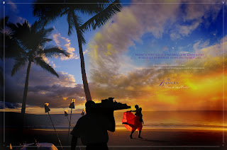
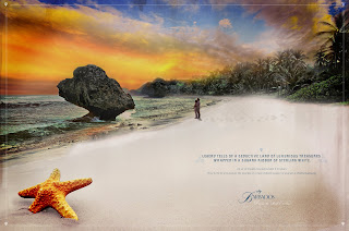
Second round of concepts for Barbados Tourism. The direction these ads took intended to address a location and marketing dilemma that Barbados has with US travelers. Most Americans have heard of Barbados but few have traveled to experience it due to it's location of being the Caribbean's Southeastern most island. Founded by the Brits give the island it's altogether different quality than the rest of the Caribbean islands, a fact Bajans are intensely proud of.

We treated the ads like they were written much in the style of an explorer writing about discovering a strange and exotic land for the first time. The style of the visuals are certainly modern day and show some of the Brits influence and were photographed in a over saturated style to lend to the vibrance of the Barbados experience.

One thing I know the British didn't pass on was their dental hygiene.

9/28/08

Nations Rent "Monumental Spread ads campaign"


Spread ads for Nations rent. Contractors of large commercial projects was the target audience. No nonsense sort of guys. We chose to focus on buildings that have stood the ultimate test of time with some fun comparisons we felt these type of guys could relate to plus I chose to really dirty the look up because lets face it, contractor and job foremen are a bunch of filthy slobs that never wash their hands before they leave the crapper.

Union Station "Ultimate X Extreme Screen"


Poster series promoting an extreme screen experience like non other I have seen. We got a sneak peak before creating the promotional posters and let me tell ya, to this day I think I have thoracic vertebrae out from watching that movie. Lawsuit? Pending.

Union Station "American Originals Exhibit"


Poster series promoting a collection of many of the most important historical documents that shaped the good ole' US of A. I felt unbelievably patriotic that week. The next week I was back to normal.

99 Bottles of Beer


99 Bottles of Beer is a place I wish I owned, maybe not in the same unlucky location as the owner chose because it's now out of business and certainly not because of the fun poster series and logo I created for them, heavens to Betsy no, just a really bad location. Great beer store idea though, fantastic selection and the concept of "mix and match" six pack way ahead of it's time. Just a really bad location.

9/24/08

Creative Challenge Poster Series 1


An internal call for entries of fellow creatives in an attempt to motivate them ever so closer to those silly elusive awards we all so covet. The idea behind the series was to take several creatives within the department and show through six degrees (or less in most cases) that the creative professionals we strive to be most like are only separated by a couple industry professionals. The headline on all reads " Your closer to greatness than you think."
Special thanks goes out to Kevin Bacon for this ideas inspiration.

Creative Challenge Poster Series 2


This poster series was an internal call for entries challenging creatives to remain inspired through the many pitfalls their concepts often take. We accomplished this by using examples that resulted in colossal failure but at least they gave it their best before going down in flames.

Bayer Advantage print campaign "Extremes"


This campaign illustrates the outlandish alternative a pet owner may take to protect their precious little Fifi. What are they going to do, build an armour suit or stuff Morris into a neoprene wetsuit? Don't be an idiot, just shell out the sixty clams and get some Advantage.


Bayer Premise print ad "Clue"


Spread ad concept for Premise termite control. We didn't win the pitch but we sure killed a lot of account executives trying. That stuff really works!